BFF: Streamlined Dashboard
So far, our BFF (BETA Feature Fridays) series has focused on new search tools that we’ve included to help you find materials faster. For this week’s edition, we’re taking a step back to take a look at the brand new, streamlined Dashboard.
The MNB Dashboard is the central navigation hub for your entire account. The original Dashboard was loaded with information and links to get you where you wanted to go faster, but the new BETA Dashboard is stripped down for ideal efficiency. We put all your critical campaign info front-and-center, and shifted additional navigation options to the tabbed top menu (which we’ll touch on in a later post).
Before we break down what’s included in your new Dashboard, let’s (excuse the self-back-patting here) talk about why it’s so great. The new, ultra-slim Dashboard is not only easier to navigate and loaded with essential information, but it’s also better suited to view on multiple platforms. The new MNB features a reactive design that automatically resizes to best fit the device on which it’s being viewed.
That’s one of the other reasons we wanted to pare down the Dashboard utilities. Trimming to include only those most critical elements makes mobile navigation even easier, allowing you to handle your email marketing biz no matter where you are.
Alright, let’s take a quick look at what your new Dashboard includes.
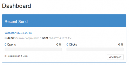
The first thing you’ll notice is that we’ve prioritized the report data from your most-recent newsletter send. Every time you log-in, you’ll be immediately greeted with the basic information about the last newsletter issued from your account (Newsletter Name, Subject, and Send Date), along with two bar graphs displaying Open and Click percentages (with full numbers below). In the bottom-right corner of the Recent Send module, you’ll see a View Report button which will take you directly to a more detailed look at the data collected from that send.

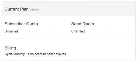
Immediately below that, you’ll find the Current Plan module. This includes basic details about your MNB billing plan to keep you updated on the status of your account.

Now, there’s one more feature we want to point out: nestled in the top-right corner of the Dashboard, you’ll see a Build Newsletter button. Clicking that button will take you directly to the Choose Layout screen in Genie, allowing you to jump right into the newsletter creation process with a single click.

And, that’s it! You’ll find the rest of your regular navigation utilities neatly packed in the top menu, arranged in (what we think is) an even more intuitive order than ever before.
Coming soon (enough): there will also be a summary module of your subscriber list to include to numbers and growth (positive or negative). Stay tuned.
As always, feel free to contact our live support if you have any questions about the new MNB BETA or your service in general.